Sunday 14 June 2015

Pitch Presentation

Finalised Production Plan

Analyzed the relationship between Magnums print adverts and their TV adverts. (Frequency)


The relationship between Magnum print adverts and their TV adverts
The relationship between Magnum print adverts and their TV adverts are that they both relate to each other. The words used in the the print advert "The Best Ice cream we've ever stolen" links directly to the TV advert, because in the TV advert we have both celebrities who are on the print advert, stealing an actual Magnum gold in the TV advert. Once You see the TV advert you will recognise the actors on the poster, vice versa. Both TV and print advert both have the same target audience which is aimed for adults who adventurous, not afraid to try something new. The TV advert and print based advert states that Magnum is a cross media platform campaign. Both TV advert and print based advert can be used internationally as the celebs used are world know superstars.

Frequency 
Frequency is a high known factor in media advertisement. How many times the target audience sees the poster, TV advert. The Frequency for Magnum Gold is high as there's more chance when you have cross platformed campaign. The target audience for Magnum Gold is adults, adults in busy cities tend to go to work on buses. Magnum have specifically placed the print advert on the side of a bus. By doing this, Magnum have increased there frequency because thousands of target audience members will see it. A international TV advert means that the frequency will go even higher as there's more chance that a target audience member will see it.      


https://youtu.be/7NGg2feEhHs

Client Feedback

On the 25th we spoke to Luis, owner of Nanna Mexico. We spoke to him about the history of his company and what he wanted for his advertisement campaign.

Luis wanted us to create an inside and outside poster for Nanna Mexico. The idea was to lure people in with outside poster, and to gain feedback from the inside poster. With feedback he could find out what his target audience liked/didn't like. The target audience was tourist and students who lived around the Cambridge area.

We sent Luis a the final posters a few days after.

Client Feedback on Final Posters
‘Hello guys,
Very well done. The documents you produced are excellent and we will use some of your design in the production of material. Both items reflect very well the image of the company. The design and layout is very attractive. The way we may use it is by isolating an item of the poster to highlight its content. That way the impact of that particular item will get maximum and immediate attention to the quick glance.
I particularly liked the use of colour in the background and the distribution of images.
It is always a pleasure to work with young and talented people. Work hard and I wish you the best.
Regards
Luis’

Upon receiving our client’s feedback, to say the least, Louis and I were very proud of our selves when we had read the email. As you can see, Luis made it clear he was really happy with the final look of the two posters and wishes he would use some of the features for the official poster that will be hung up in the restaurant. One of the features he loved about our posters was the use of colour and how much of an impact the poster gives to viewers eyes on a first glance. Overall, he was very happy to have worked with us.

 After receiving our feedback, we pushed to our limits and made sure we stuck with Luis’ wishes, making the poster bright and colourful and also an invite to our target audience. We followed the advertising plan very well and kept to what the target audience wanted.  

Resources and equipment we will need:

1 good quality camera
Tripod
Photoshop
Tablet
Nanna Mexico Logo
Nanna Mexico information 
Pictures of food 
Location and opening Times
Client number


Budget Plan 
(Over all income from Louis and Josh)
8 hours X 3 a week = 24
24 X 3 = 72
72 X 5.13= 369.36
369.36X2 = 738.72

Three Ideas:
Two Nanna Mexico Posters - £5 or free from Long Road (3 weeks to produce, 1 hour to print)

£10 - £538.72= £528.72

Legal and Ethical 
When creating the poster will make sure that no offence is made towards any Mexicans. No racial or discriminating content will be used on our poster. The use of cliché Mexican symbols won’t be used within the making of the poster. We will aim not be stepping over the line over any words of phrases that will offend people.


Final Posters after Feedback


Wednesday 13 May 2015

Our Task

Our Task

What do they want us to do?

We have been asked by Luis Navarro the owner of Nanna Mexico to create a poster for people to see when they pass the shop. The poster will be located at the front of the premises. The advert is for shoppers and tourist. THEY WANT US TO SAY that its healthy food and every one can afford it.

The Target Audience

Shoppers and tourist. Shoppers and Tourist are people over 30 that have the power to spend money and travel.Fresh and healthy food all can afford.


Most Important

Fresh and healthy food made your own way.


'BUY FRESH

COOK SIMPLE

WASTE NOTHING'


How Long will it the poster last?

6 months / 1month

Ideas


1:Step by step on how to eat a burrito, with images. The use of this advertisement would promote and instruct the customer. 

2: 'The smells, the colours, the textures and most importantly, the ingredients of my nanna's kitchen are what you will find here. The use of his Nanna may be a good way forward, relate to the customer by using his Nan and how she inspired him. Promote this!' 


Mood Board

Nanna Mexico Poster Mood Board


Today we made a mood board representing Mexican related food, wrestling and movie advertisements. We have done this because we wanted to give a professional look onto the poster we will be making, with the full range of colours and art style like these examples, we could potentially make a great poster giving off a mexican atmosphere towards the customers.     

Risk Assesment

Risk Assessment Of The Journey To Nanna Mexico

Rough Ideas

Rough Ideas for Nanna Mexico

Idea 1: A poster giving a preview of the places food menu and contact details


(Left) This is the poster we are planning to use on the outside of the restaurant, the brown colour will be the title, the blue and the pink will be deals. Such as, meals cost only £10 when it is 17:00 and Twitter Tuesday, the white box on the bottom left is a preview of the restaurant food menu, the yellow boxes with the orange rectangle are pictures of successful foods and the deals they come with.
(Right) The poster here is for the inside, mainly for costumers who want to give feedback or any complaints to say to the owners. There could be deals and customer information on the poster, phone numbers and email addresses and a Tumblr, Facebook and Twitter information.      

Idea 2: A musical advert (Video)


This will be a short advert starting with a man washing up the restaurant's kitchen, he begins to hear a catchy song and turns it up, this then leads to everyone in the restaurant dancing and eating the restaurant's food. Everyone is happy and enjoying themselves during the process. 


Idea 3: Clothes


One idea we had thought was to have the Nana Mexico logo on a shirt or hoodie, coming as a deal if you order online or even free with by ordering a certain type of food. 


Cambridge Tv Broadcast for Advert

The Cost Of Advertisment On Cambridge Radio Stations and Television

TV Advertisement for Nanna Mexico
With the success of my selected company Nanna Mexico, a TV advertisement could be possible. I have done sone research and the cheapest deal for a TV Advertisement is around £10,000. The TV advertisement company I went with is the cheapest and most efficient around. We have already come up with the idea for our TV advert for Nanna Mexico. The idea we went for is an advert based inside the restaurant. This wil be a musical advert which creates a catchy tune that will imprint itself on to the viewers mind. The advert starts with one the employees washing in the kitchen listening to music.This progresses on to a catch Nanna Mexico tune with some crazy dancing.


Radio

Poster Price

Poster Price

Cost Of Advertising Poster

The cost of creating the poster won't be too expensive. If creating two posters then the cost will be around £13maximum. This image comes from a local printer company so it will be easy to print out the poster once finished. The size of the posters we are making will either be A2/A1 sized.
We have been asked to create a print based product for Nanna Mexico. The brief asked us to create a poster for the front of their store, which can be displayed to tourist and shoppers. I have found a local print company which provides large print outs for affordable prices. I have found the cost of other print based Media's in case we promote this option. Billboards are an expensive option but have a higher probability of luring tourist and shoppers. A cost of a billboard for a month would be around £300. The cost for an A1 printed poster would be £5 and A2 would be £4.  

Poster Development

Poster Development


On this poster, my partner and I aimed on the colours, our client gave us a colour code and we kept a close eye on what colours to use. The challenge we had however was the fact some colours on the code would clash and our aim was to put colours together that embraced the simplicity and eye catching look to the customers. We put the logo behind a light blue background, giving it a friendly 'hello', then using the colours; pink, yellow, white to combine the colours together and to suit each other. Having done that, we put two snake like symbols next to the logo to give it a more mexican feel. 
On this poster, we began to think about pictures of the food. We were very careful here as we didn't want to put too much or too little pictures, considering the customers are going to have a quick glance at the poster, having a small preview of what is to come within this restaurant, on this rough look of where the pictures could be held, we wanted to place the pictures of food in a simple place on the poster. After placing the pictures we put a symbol in-between two pictures to give them some space as we didn't want the pictures to be close together, doing this made it look more simple and spread out, easier for the customers of where to look. 
Finally on this poster we added three posters of the deals the restaurant offers, at first we thought about giving a preview of the restaurants menu, however, we then thought it would be best to show the deals more than the menu as our aim overall for this poster is to make the customers to come inside, we want them to be curious of what type of foods they sell, they will look at the deals, like them and investigate 
of what they could have for £10.

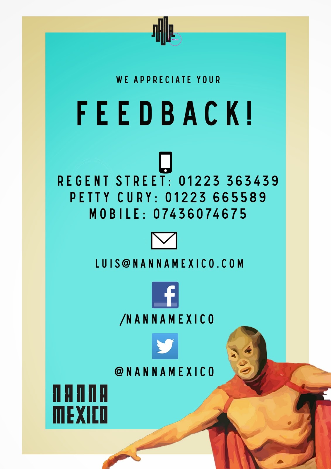
The second poster's main purpose was to be an inside poster, for customers who are looking for information, for the start of the poster we wanted a clear simple look of a poster, we placed a mexican wrestler in the corner to remind customers that this is a mexican restaurant and it suits the layout and colour of the poster. We also put icons of social networking of where the customers can come in contact with the owner and the workers of Nanna Mexico such as; facebook, twitter and tumblr.  

Nothing much has been added on this poster development except for the icon of the phone, we placed this after discovering they had a phone number on their website, placing this wil make them become more clear and understood of the many ways of contacting Nanna Mexico and giving feedback and compliments.
For our outside poster for the final we added more of a colourful vibe to it, we began to think about the word 'fresh' a lot, it is restaurants aim to let customers know that the food they make is fresh so we got a picture of vegetables and placed it on the side, knowing that the customers won't look at the words first but the picture, instantly knowing that this place uses 'fresh' food. We also placed a quote from the website 'Buy Fresh, Cook Simple, Waste Nothing.' Next to it, as a small moto also looking like a ribbon around the poster in a neat fashion. When it came to the pictures, we were very careful not to over crowd the poster with pictures so in the end, I had the idea of placing only two pictures of wonderful looking foods on each end and leaving a blank space for writing about them. I did this because it would even out the attention of the poster and make it not crowded, doing this in fact made it on the edge of being crowded but it was just enough in my eyes to make the poster stay true to being simple and clear for customers. We kept the deals up and the colours, one of the small changes however was that we added a 'order online' mini poster with a orange and green van, we chose this because we it suited the variety of colours that were already on the poster and wanted it blend within it, as if it is part of the poster. 


When it came to the second poster, we had a hard time to think about of what to add to make it more presentable, we didn't want it to be a poster full of words and blank spaces so we researched on the brand book and website and found the types of patterns they are aiming to use in the near future, this inspired us to try it out and luckily it was a success, we placed it on the bottom of the blue box and top of the yellow box, doing this made it look professional and simple. However, I think the biggest problem we had was the fact we didn't really have a idea of fonts we were going to use, considering our client didn't get back to us, so when it came to writing down the links and information, we went through fonts that looked similar to the fonts they gave us, it was a long shot personally but I felt it was worth our time. We took away tumblr as a contact option and replaced it with an email, this way it was more of a personal direct for people to talk to the owner to give their feedback. For me, i think it is better that we chose this option than tumblr.  

After the given feedback, I took it on board and changed a few things. All the boxes inside the boarder are now in lined with each other, so they are completely straight. I have also changed the look of where to order online by putting the website where to get it from logo, to make it easier for audiences as they won't be standing on the street reading it. With discussion and planning, we also lined up the words 'Buy fresh, cook simple, waste nothing' to be readable. We got rid of the pink dragon as it look too much like a Chinese restaurant and we made sure everything on the poster was in high quality and looked crispy clear.  Moreover, we got rid of the boarders around the deal boxes to make them look more clear and clean. 

After given feedback for our second poster, we completely changed the layout for it. We re-organised the fonts, the structure and the sizes. We changed the links to the facebook and twitter page, showing their names, not the link as it took too much space within the poster. The wrestler we increased the size of to get the attraction of the poster,